Contrast Sensitivity Curve
Measurement of contrast sensitivity resembles audiometry: a pure tone audiogram depicts which are the weakest pure tones at different frequencies that the person can hear. Contrast Sensitivity Curve or visuogram shows the faintest contrasts perceived by the person. If the stimulus is a sine wave grating, then the curve depicts similar function as does the pure tone audiogram. If the stimuli are optotypes (letters, numbers or paediatric symbols), recognition is required. The test resembles speech audiometry. As in audiometry, the result of the contrast sensitivity measurement is not one single value but a diagram.

Figure 1. Contrast sensitivity curve. Visual acuity is plotted along the horizontal axis and contrast sensitivity along the vertical axis. The curve shows that we only see small details at high contrast levels, corresponding high visual acuity values. Visual system is far more sensitive when the details are large. We can see them at less than one hundredth of contrast compared with small details. The contrast sensitivity curve depicts the boundary between visual information that we see and information that we do not see because it has too faint contrast or too small details.

VISUAL ACUITY
Figure 2. Demonstration of visual information below the contrast sensitivity curve. The size of the symbols decreases along the horizontal axis and they become paler and paler in the vertical direction. Where the optotypes disappear there is your contrast sensitivity curve.
The boundary between symbols perceived and those that are too small or too pale and thus not seen, is depicted by the line of this boundary, called Contrast Sensitivity Curve. Its declining right-hand slope is the most interesting part of the curve in clinical cases. To define the slope of the contrast sensitivity curve, we need two or three measurements. The first one defines the point at the x-axis, the visual acuity value determined in the usual way. The second is the definition of the upper end of the straight part of the slope usually located in the 1 to 5% contrast area. An additional measurement at lower contrast is sometimes of interest.
The threshold values can be measured with two different techniques when using optotype tests:
- By using low contrast visual acuity charts, or
- by using tests with one symbol size and several contrast levels.
When we use low contrast visual acuity charts we measure in the horizontal direction as shown on Figure 1 and 3, whereas when we use one symbol size at 2 or 3 distances, we measure in vertical direction.
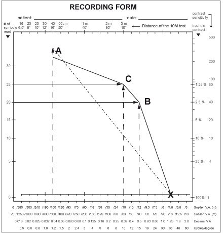
Figure 3. The contrast sensitivity curve can be measured using low contrast visual acuity charts in a light box, in which case the measurement is depicted with horizontal lines at full (not “100%”) contrast, and at one or several lower contrast levels. If the measurements use tests with one optotype size, the testing lines are vertical starting from the size of optotypes used.
In assessment of normal or close to normal vision measurements with the 2.5% chart result in the visual acuity at point B or lower VA values. - Because nearly 90% of persons/children with visual acuity between 1.6 (20/12, 6/3.8) and 0.1 (20/200, 6/60) will get a result at the 2.5% contrast level, the 2.5% chart is the most useful one. Those persons who do not perceive the 2.5% optotypes at any short test distance, are tested using charts with higher contrast levels. The 1.2% chart reveals the beginning of the bend of the curve at point C.
In Figure e the LEA tests 10M optotypes are used as an example of tests with one optotype size. In this test there are test pages at contrast levels 25%, 10%, 5%, 2.5%, and 1.2%. We usually show the test at the 3 m distance (used in the measurement of visual acuity at full contrast) and then move to 5 m distance (which corresponds to visual acuity 0.5, 20/40, 6/12) and show the 10% contrast page asking what is the first optotype and then what is the second optotype (this gives time for the visual system to adapt to the low contrast level), then similarly the 5% contrast page and the 2.5% contrast page. If the person does not perceive anything on the 1.2%, we go back to the 2.5% page to confirm the threshold and record it giving 5 points to each higher contrast page even if the whole line was not read and the number of optotypes (5 in this case) read correctly at threshold. Next we show the 1.2% contrast page and move closer half a step at a time until the person starts seeing the optotypes. In the above case the distance was 3 m corresponding visual acuity 0.3, 20/60, 6/18 and all 5 optotypes were correctly recognized. The vertical lines at the distance of 5 m and 3 m correspond to visual acuity values 0.5 and 0.3. Their crossing points show the visual acuity values at 2.5% and 1.2% contrast levels in this case.
The two types of measurements lead to the same result. The luminance level is better controlled when standard light boxes like the ESV1500 Illuminated Cabinet are used.
In the Figure 3 there is also a vertical line at much lower visual acuity value. With these large optotypes very low contrast values are measured (Pelli-Robson). The very faint contrasts correspond to shadows on newly fallen snow on a cloudy day or shadows on white or black surfaces if the surface is slightly uneven. People in occupations where similar contrast situations occur should be examined using this test.
The result (point A) when joined with the full contrast visual acuity value is a straight line (A-X) and does not depict the form of the contrast sensitivity curve.
Since the Pelli-Robson test is large, it cannot be moved farther to function at higher visual acuity values. However, if the subject to be tested moves to different test distances, the same visual acuity values can be used as with the LEA 10M test. The same applies to MARS test. For comparative studies the tests should be printed by one printer, all three on the same plastic to find whether the minute differences between the tests are related to small differences in printing and/or luminance levels on the tests and are not related to basic differences in the definition of contrast and use of the test as sometimes has been claimed (Leat 2004).
Several studies, like Candy et al. (2011) and Vaidhyan et al (2007), have recorded the very small differences in the sets of optotypes of the LEA SYMBOLS® and Numbers compared with the Sloan letters. The LEA optotypes are a fraction closer to the Landolt C because each of the optotypes was singly calibrated with the Landolt C, whereas the set of Sloan letters was not calibrated that way and its set of letter optotypes therefore has internal variation in recognizability. The differences in the tests are so small that they play no role in clinical assessments. The real difference is how the Pelli-Robson and Mars test have been used at only one optotype size.
References:
Candy TR et al, Adult Discrimination Performance for Pediatric Acuity Test Optotypes. Invest Ophthal Vis Sci, 2011, 52 (7): 4307–4313.
Vaidhyan JJ, Lietzen P, Ah-Kine Ng Poon Hing D, Pathak A, Ahonen E, Quinn N, Lyons S, Leinonen M, Hyvarinen L, Moore B. Comparison of Visual Acuity Measured with Lea Symbols and Lea Numbers to Adult Standards. ARVO 2007 Abstracts p. 236.
Leat SJ, Wegmann D. Clinical Testing of Contrast Sensitivity in Children: Age-related Norms and Validity. Optometry and Vision Science, 2004, 81 (4): 245–254.
![]()
![]()
![]()
[ Instructions I Paediatric Vision Tests I Vision Tests ]
This document was last modified on